VISUAL IDENTITY & UI DESIGN 2025
Perrfect Paws — Bringing Digital Warmth
to Local Pet Care.
Visual Identity & UI Design for a premium grooming salon.
01 · The Challenge
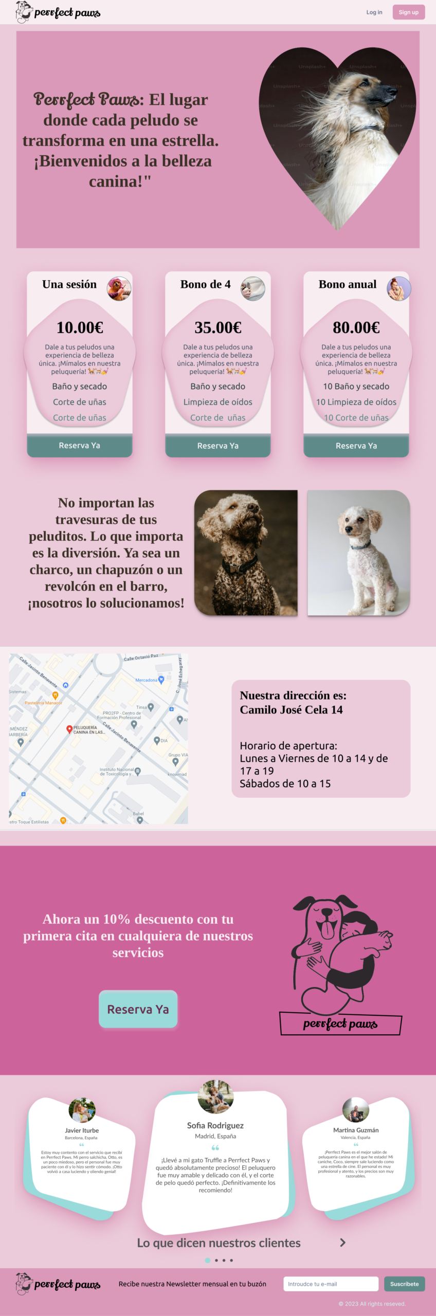
A local pet grooming salon needed to transition from a traditional store to a digital experience. They required a visual language that communicated "luxury" and facilitated easy booking — without losing the warmth and care that made them special to their clients.
02 · Building the Brand: From Logo to Interface
Logo Design: Empathy in Stroke
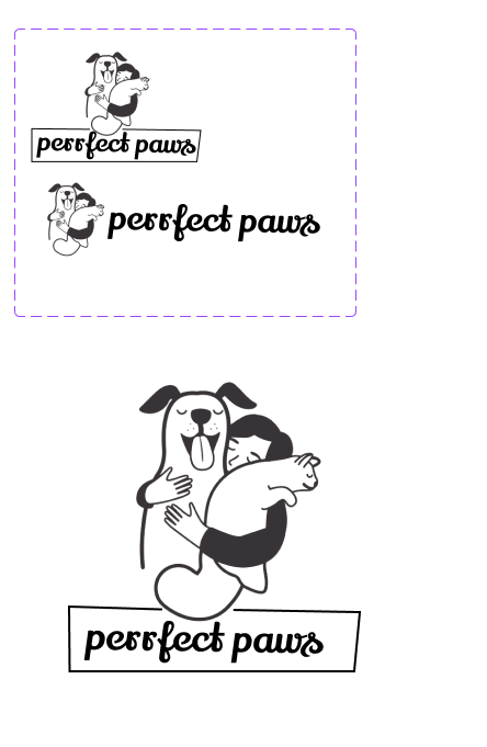
The core mission of the salon is rooted in the owner's love for their pets, transforming a grooming service into a pampering experience. The logo was designed to capture this emotional connection, focusing on the concept of owner love and care over complex detail.
The final logomark utilises rounded, minimalist strokes to create an approachable, gentle aesthetic. This deliberate simplicity ensures the mark conveys warmth and affection, acting as a direct visual representation of the bond between the owner and their furry companion.
Color Palette: Sweetness and Trust
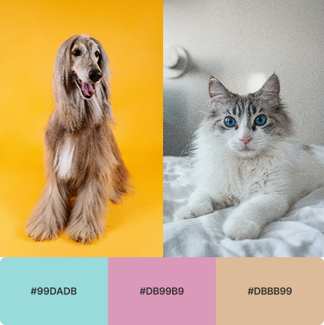
The brand palette was crafted to reflect a sense of sweetness, softness, and indulgence — much like a luxury pastry shop. I selected pastel, inviting colors to create a non-clinical, pleasant digital environment that encourages users to stay and explore the services.
This choice was strategic: the soft hues evoke a feeling of tender care and trust, reinforcing the salon's promise to provide the ultimate pampering treatment. The resulting aesthetic successfully positions Perrfect Paws as a high-quality, affectionate service, rather than just a functional pet wash.
Soft Shapes: Emotional Design and Trust
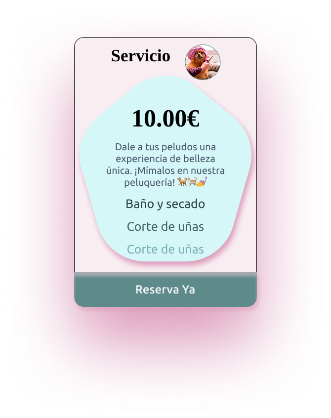
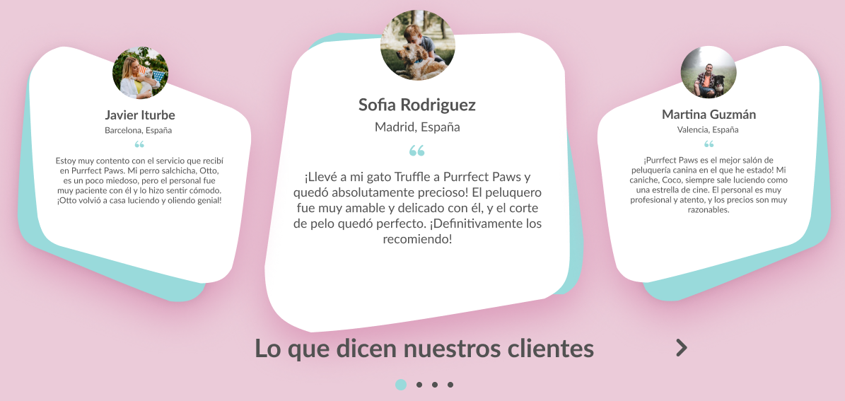
The use of rounded corners and soft, organic shapes throughout the interface — particularly in the price cards and testimonials — serves a dual purpose rooted in emotional design. Soft shapes feel inherently safe and approachable, directly supporting the brand's core value of gentle care for pets.
Unlike sharp edges, which can feel harsh or clinical, rounded forms communicate warmth and reduce cognitive friction, making the user feel more comfortable exploring the premium services. These forms visually echo the softness of the pets themselves, creating a cohesive and empathetic brand experience.
Layering and Visual Hierarchy
The application of superpositions and layered elements — as seen in the testimonial cards and how the image cuts into the price cards — is a deliberate strategy for visual hierarchy and depth.
By making these cards appear to slightly "float" above the background, we achieve two key outcomes: Focus and Premium Feel. The layering effect immediately draws the user's eye to the most important content — the pricing and the customer feedback — increasing scannability. This depth creates a modern, high-quality aesthetic that reinforces the brand's positioning as a premier and luxury service.
03 · Responsive Showcase
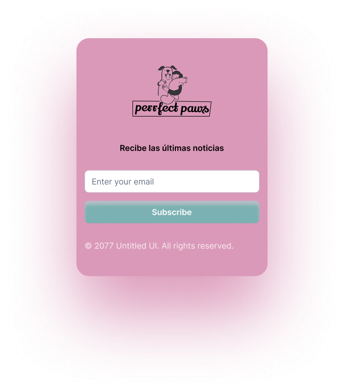
Mobile-first adaptation — the full experience was designed from mobile up, ensuring the premium feel translates seamlessly across all screen sizes.

04 · Retrospective: Moving from Visuals to UX
What I learned and how I would iterate today.
Accessibility · Colour Contrast Audit
Although the soft pink palette effectively conveys warmth, a post-launch WCAG audit would be essential. Specifically, the colour contrast ratio of the primary Call-to-Action button ("Reserva Ya," in a muted teal) against the light pink background of the price cards may fail AA or AAA accessibility standards.
Moving forward, I would iterate on this by darkening the teal or introducing a higher contrast brand accent colour to ensure maximum legibility and user confidence during conversion.
Performance & Architecture
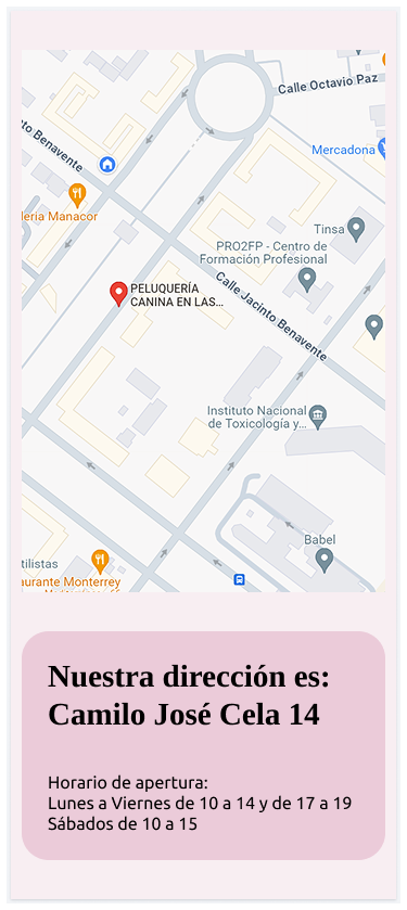
The design incorporates a map and high-resolution images. To improve LCP (Largest Contentful Paint) and mobile performance, I would swap the embedded interactive map for a static, lazy-loaded image with a direct link to the native map application, significantly reducing initial page load time.
Social Proof Integration
The current testimonials are static text elements. To maximise credibility and trust — a key requirement for a premium service — I would implement an integration with a live review platform (like the Google Reviews API). This provides dynamic, verifiable social proof, which is far more impactful than static content.
Final Thoughts
This project demonstrates my passion for translating brand identity into a highly usable visual experience. My focus is always on creating measurable impact, not just output. I'm currently seeking a role where I can apply this strategic thinking and drive user-centric outcomes.
Thank you for reviewing my work!